Queer Concordia
Branding Guidelines
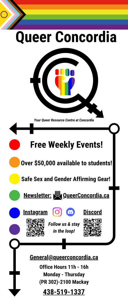
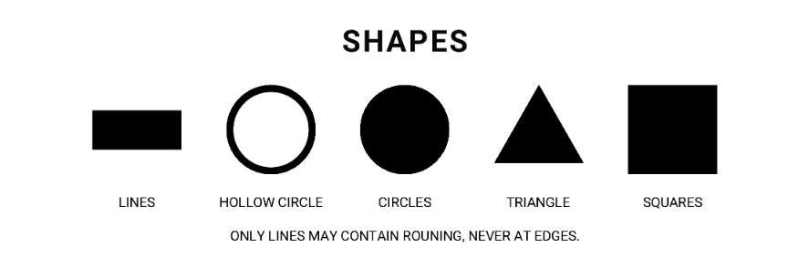
Queer Concordia typically follows a minimalist and Bauhaus style for official branding and information.
Our Instagram posts diverge from this to use colours to captivate audiences and grab attention. There is no particular theme when creating marketing posts.
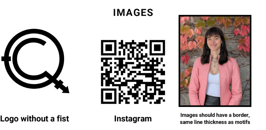
The Queer Concordia Logo is to be Logo 1 with a transparent background in all posts, and the White Logo when the post is primarily composed of darker colours. The Bubble Logo is used when the design has lots of visual clutter.
Logos

Colours
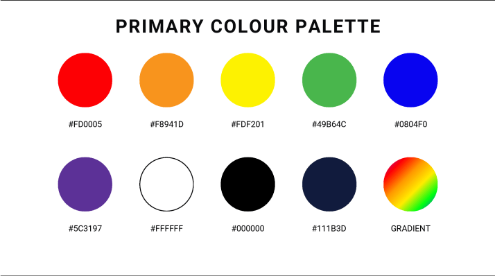
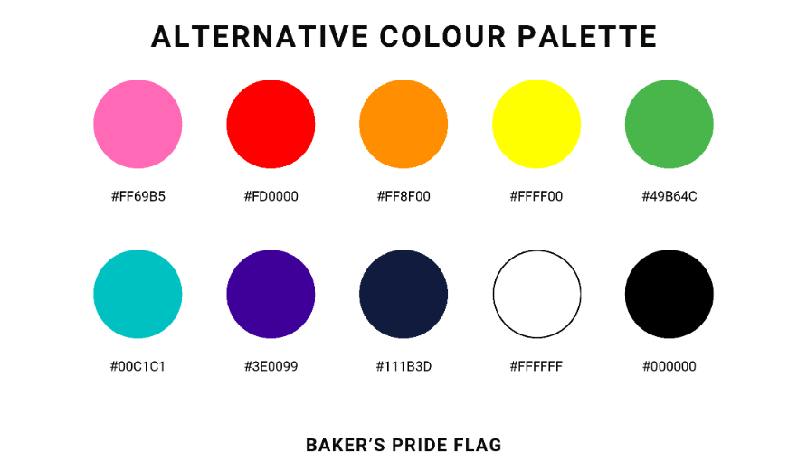
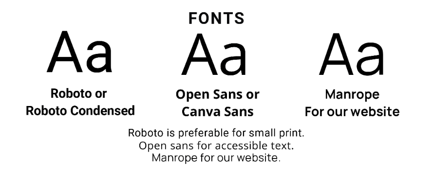
Fonts
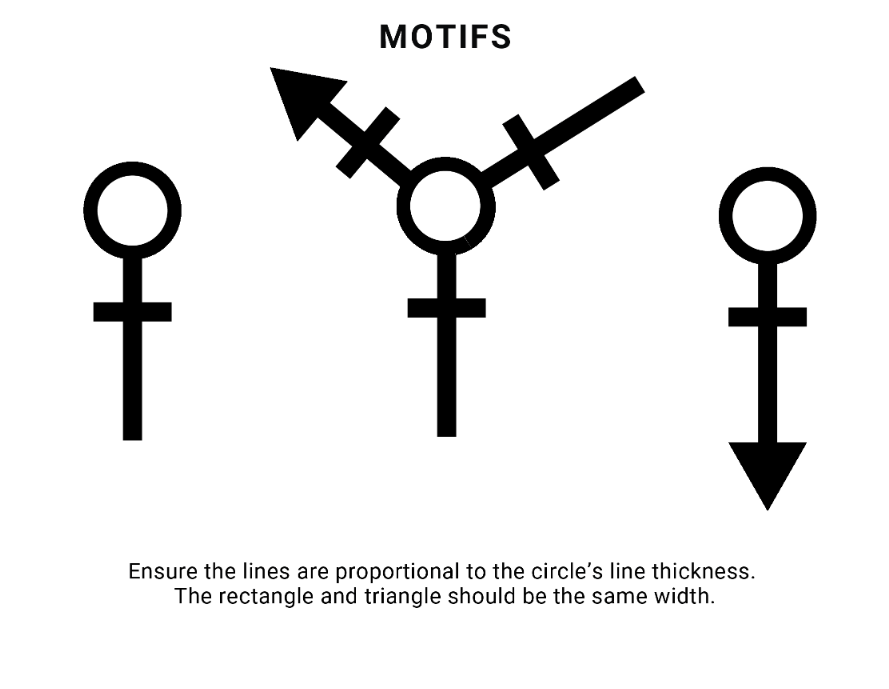
Motifs
Example
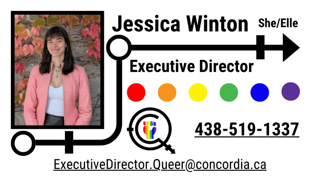
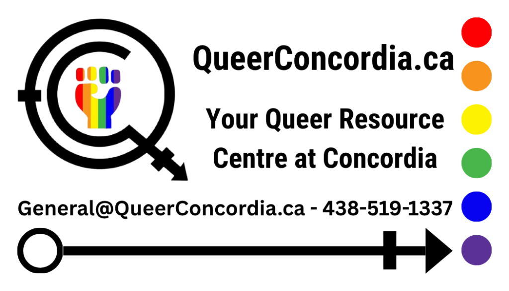
Business Card
Retractable Banner